
Process
We began the project by gathering research on known pain points and issues with the current platform and user experience. This included prior testing and workshops with stakeholders.
This evolved into a full audit of the brand, technology stack, pricing and customer experience. I found that many aspect of the business needed modernisation and made recommendations that overlapped with the redesign of the product.
We identified and built out 6 user personas that influenced decision making. These personas have grown and changed over the course of the project as we have tested these against data from our actually user base.
We then explored key scenarios covering the core functions of the application and mapped these out into user flows. At every stage of iteration in design we have consulted with subject matter experts, developers and key stakeholders to adjust what was designed and to make sure it was feasible to build.
These flows were built out into wireframes which also established the core navigation elements and content holders. view here these wireframes we used to test the basic navigation concepts with our stakeholders.
Now that we had a clear idea of the types of elements and screen configurations we needed. I started to build out our first UI system. This has grown and evolved along the way. (view below this section).
We then build out the detailed high fidelity prototypes for real world testing. These prototypes are as close to the real thing as possible allowing product managers to demo future features to our customer base and allowing for better testing with the end user. The prototypes also included full developer specs through Adobe XD and all assets in SVG and PNG format. Back in the earlier part of the project we established a scrum team which I briefly lead for 3 months to get a better understanding of developers concerns.
A process of continuous improvement and releases planning is ongoing and we have broken features down into MVP releases inline with consultations with the development team.
Below I have detailed some of the key features of the project.
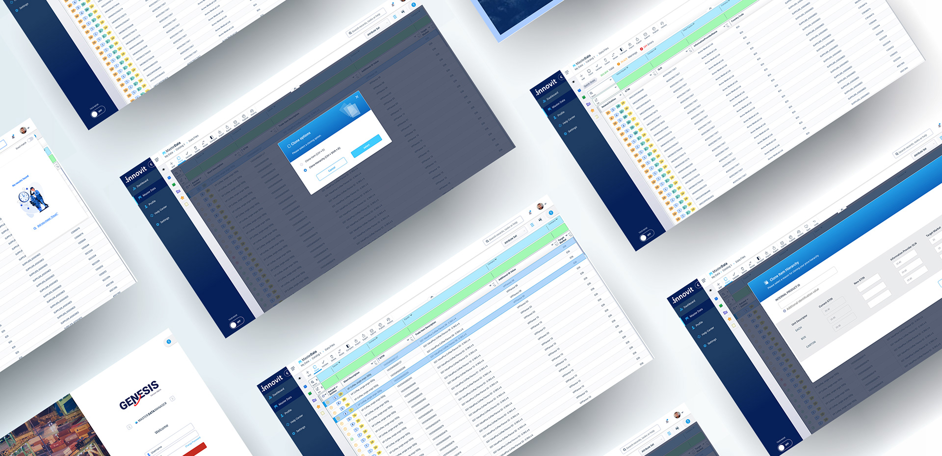
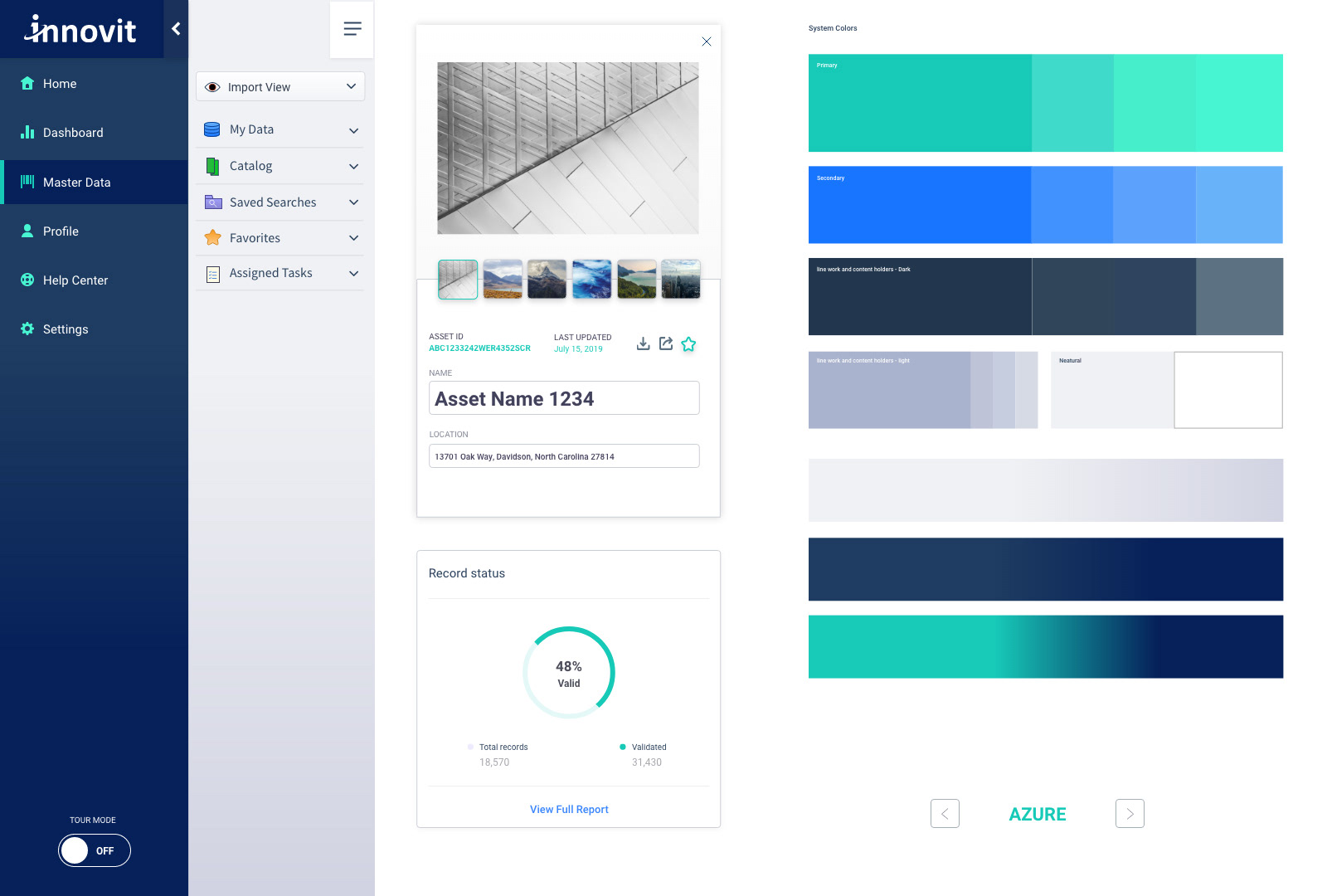
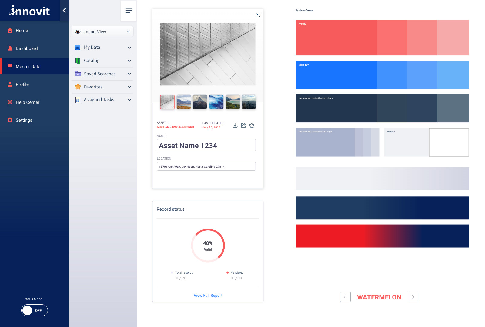
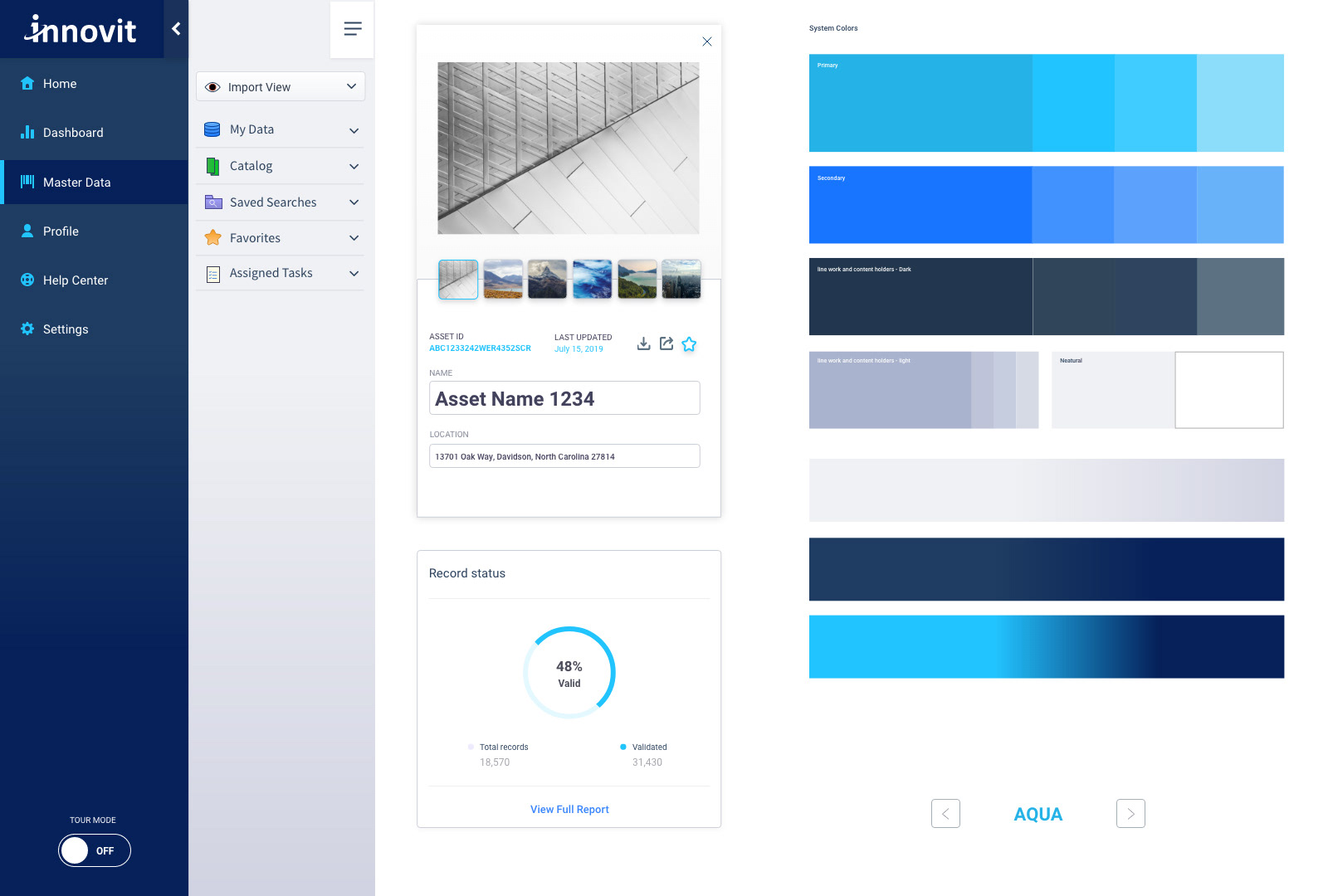
Our UI and components library is a living document that is constantly improved and added to as new requirements are discovered. It allows our development team to work off accurate specifications for each component, acting as a design handover for the team.
The Concept of mass editing or mass searching in one control bar is not a new one but we have managed to greatly improve this concept in our design through incorporating contextual menus on both the global level and on the cell level. This in turn greatly reduced the number of functions hidden away in other areas of the application or in right click menus. Overall it has made the experience easier to understand for the end user by keeping functions related to your current process at your fingertips, right next to your current area of navigation.
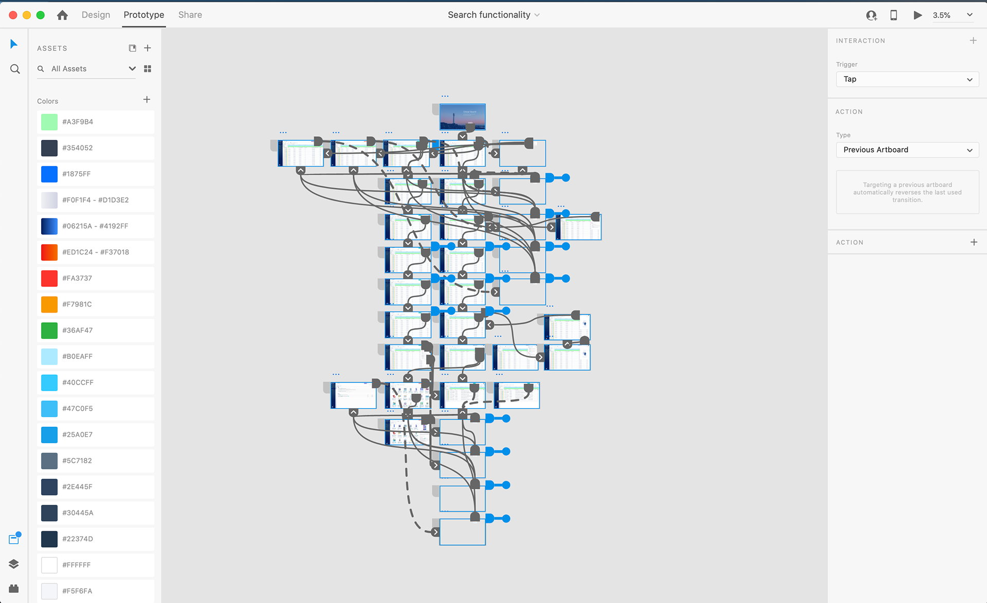
All Prototypes went through a process of wire framing then high fidelity finishes for demo purposes to internal stake holders and key clients. The prototype below was a demonstration of advanced global search function with auto completion, suggestive search and extended search results.
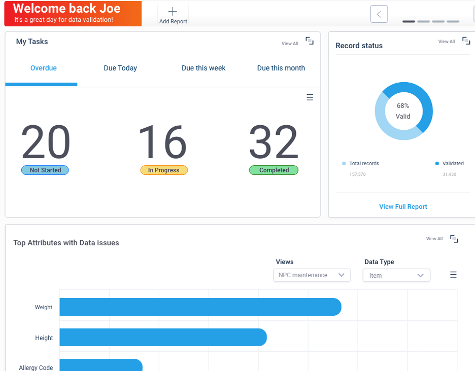
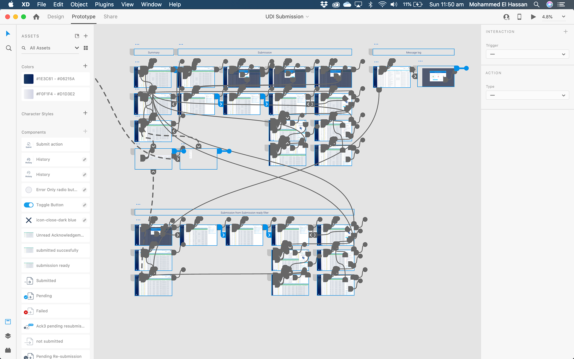
The prototype below shows the process of submitting data to a data pool and how we handle processes that take time to complete after being triggered.
Some processes may take hours because they involve external agencies like GS1 so we decided to create a panel that manages the progress and reporting for all processes and allow the user to navigate back to the main master data screen through tabs and continue their data maintenance.
We have over 20 prototypes for this project so please contact me for more information. The Genesis platform is due for MVP1 release shortly.